01
The problem
The customer portal helps customers manage their products and arrange things digitally, in a complex financial environment.
The existing environment had a complex information architecture, an inconsistent experience, limited accessibility and fragmented design decisions. That made it hard for customers, and hard to build on.
02
What I found
Fragmented design decisions caused most of the problems, not one bad screen.
Customer journey analysis and conversations with business, compliance and IT showed that usability and accessibility issues kept tracing back to the same cause: every part had been designed its own way. A structural fix needed shared building blocks.
03
Choices and trade-offs
Foundation first, then screens
We captured colour, typography and components in a design system with design tokens. That made every next page faster and more consistent.
A guide instead of a menu full of products
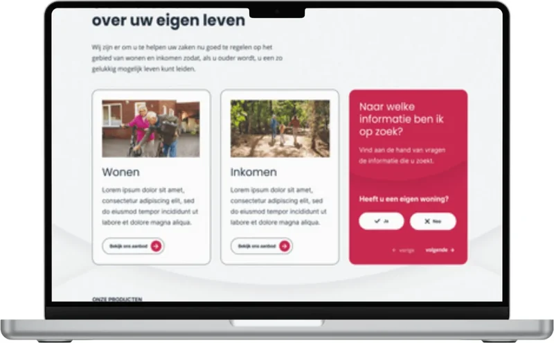
On the homepage, a few simple questions lead visitors to the right information on housing or income.
The calculator in steps
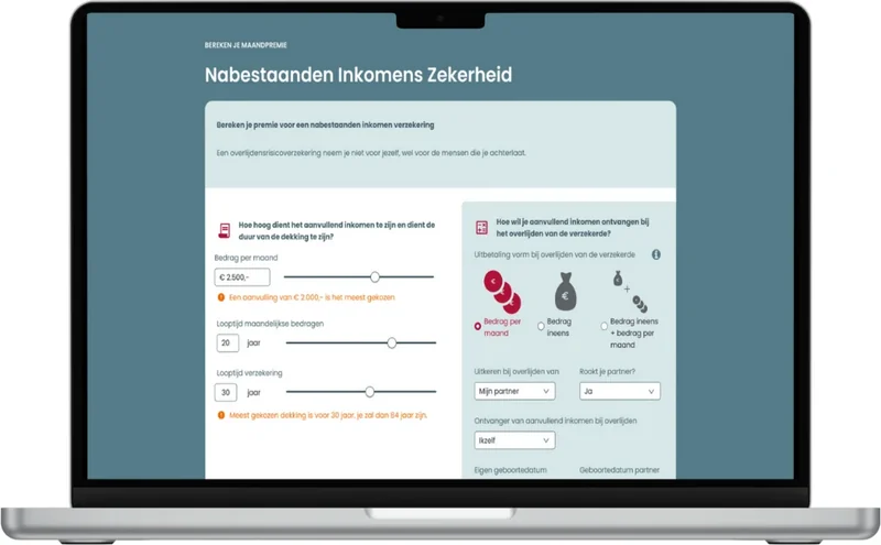
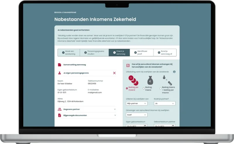
The premium calculator uses sliders and shows what most people choose. The application follows in five clear steps, with a summary to check.
WCAG AA in the components themselves
Contrast, focus and keyboard support are solved in the components, so every page gets them automatically.