01
The problem
The platform helps users orient, compare and find services in care and housing.
There was plenty of information and functionality, but accessibility, navigation and findability didn't fit a broad audience with very different digital skills.
02
What I found
People looking for a home with care search by what they need, not by how the offer is organised.
Analysing user behaviour and customer journeys showed where people got stuck: finding options that matched their situation. The platform's structure followed the way the offer was organised too closely.
03
Choices and trade-offs
Filters on what matters
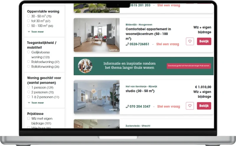
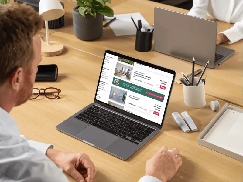
Search results can be filtered by accessibility and mobility, floor area and number of people, with the number of results per option.
Services found the same way
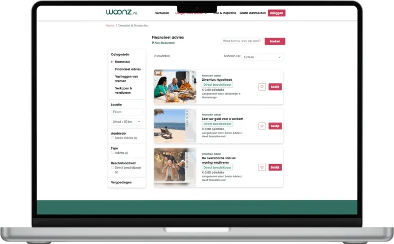
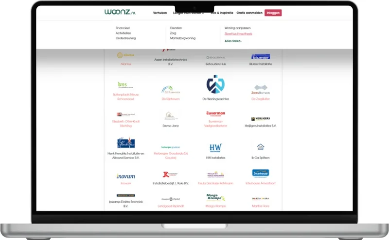
Services and products follow the same pattern: category, location and availability as filters, so visitors don't have to relearn how it works.
Information and inspiration next to the offer
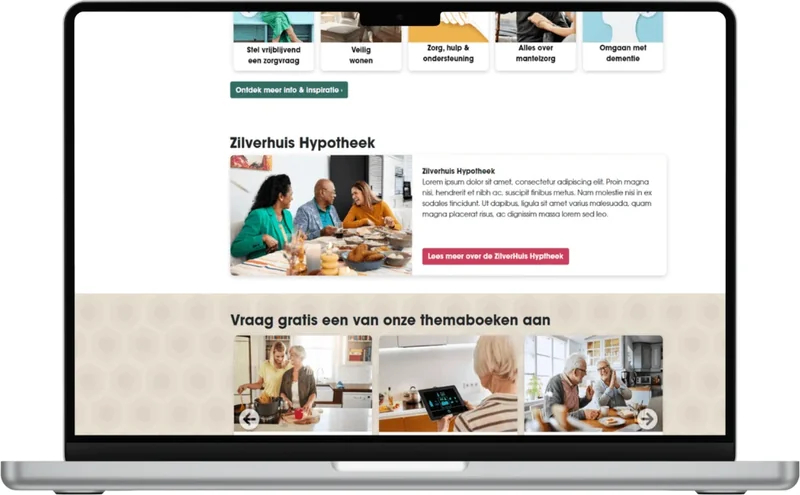
Themed information on living at home for longer, with free guides, helps people who are still orienting.
Accessible and data-driven
WCAG principles from the start, and continuous improvement based on data and feedback.