LZ Lando ZeilstraSenior UX and product designer
← All cases
Data and dashboardsProCC – Time tracking app

Making operational data clear and quick to enter in greenhouse horticulture

ProCC builds software for labour and crop registration in greenhouse horticulture. As UX designer I translated complex operational data and business processes into clear dashboards and user-friendly web and mobile applications.

RoleUX designer
Period2020 – 2021
SectorGreenhouse horticulture
Worked withStakeholders and development team
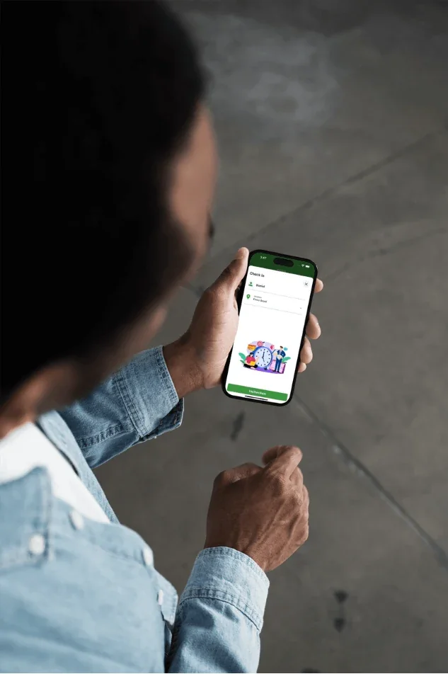
An employee checks in with the ProCC app on a phone

My role

  • Translating complex data into clear UX solutions
  • UX strategy for mobile and web applications
  • Designing customer journeys, flows and prototypes

01

The problem

The platform supports companies with planning, registration and data-driven decisions.

Different data sources, user groups and business goals came together in the applications, and web and mobile weren't consistent.

02

What I found

People registering on the work floor want to get back to work as fast as possible.

Analysing user needs and operational processes made clear that registration itself had to be as short as possible, while the data still had to be useful for planning and insight.

03

Choices and trade-offs

One big action per screen

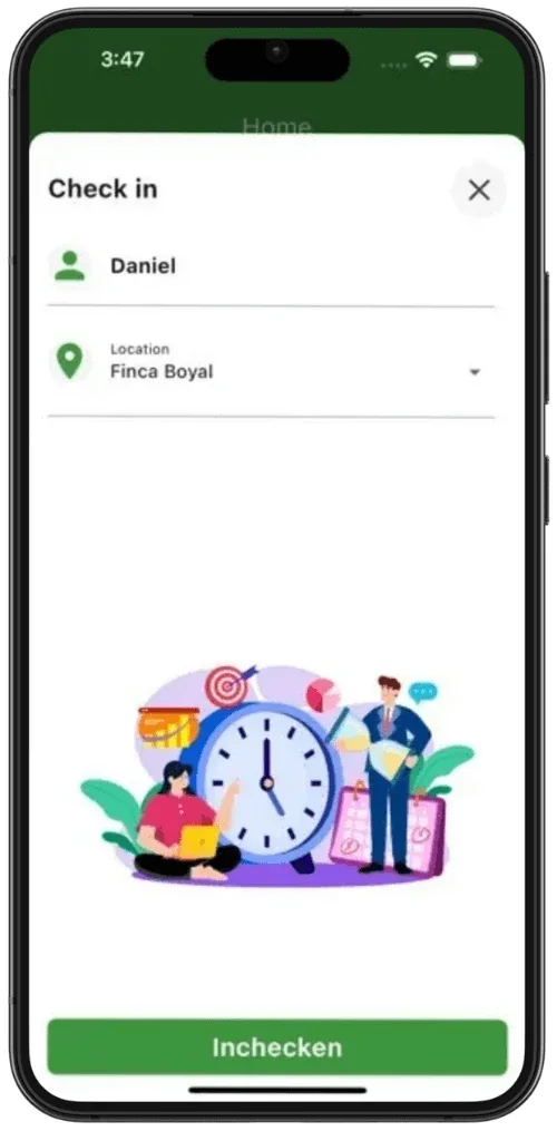
Checking in takes a name, a location and one big button. Stopping is just as direct.

An overview on the home screen

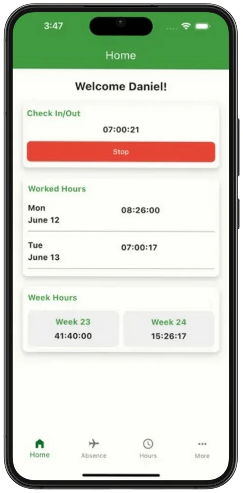
The running timer, hours worked per day and weekly totals sit together on one screen.

Absence in one overview

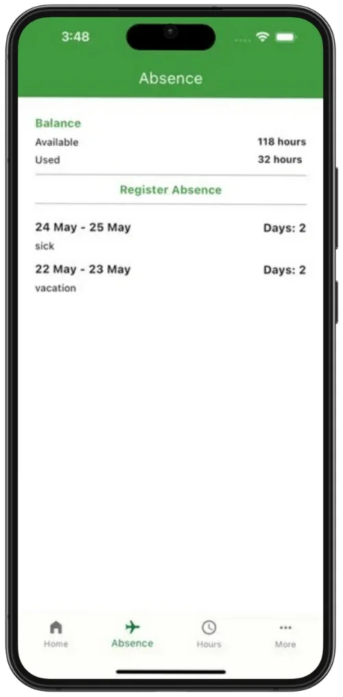
Balance, hours taken and registered days are shown together, with a clear button to report absence.

Consistent across web and mobile

The app and dashboards share the same terms and structure.
04

The design

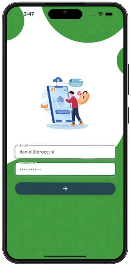
The app for the work floor: logging in, checking in, hours and absence.

Logging in.
Logging in.
Checking in with name and location, and one big button.
Home: the running timer, hours worked and weekly totals.
Absence: balance and registered days in one overview.

05

Result

  • ✓Faster insight into relevant information and more efficient task handling.
  • ✓A consistent experience across web and mobile.
  • ✓Better translation of operational data into useful insight for decisions.

06

What I'd do differently

UX is also about making complex information accessible. The simpler the input, the more reliable the data others base their decisions on.

Work together

Does this challenge sound familiar?

I'm happy to tell you more in a conversation, including what didn't fit in this case.

Get in touch View LinkedIn