LZ Lando ZeilstraSenior UX and product designer
← All cases
Mobile appAttenza – Care app

Bringing care requests and care providers together faster in palliative home care

Attenza builds digital solutions for palliative care at home, matching care requests with care providers. I improved the user experience of its applications and internal systems, focusing on supporting critical care processes in the daily practice of care professionals.

RoleSenior UX and product designer
Period2021 – 2023
SectorPalliative care
Worked withCare professionals, stakeholders, development team
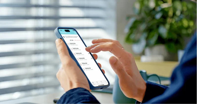
The Attenza app with care requests on a phone

My role

  • Developing UX strategy and user flows
  • Designing and validating applications and prototypes
  • Connecting user needs, business and development

01

The problem

The platform helps care professionals match care requests with care supply, and plays an important role in daily care processes.

The existing applications brought together different user groups, interests and information needs. Workflows were complex, while information needed to be dependable and clear.

02

What I found

A care professional needs to decide at a glance whether a shift fits.

Working closely with care professionals made clear which information drives that decision: when the shift is, where, and what it pays. Everything else could wait one step.

03

Choices and trade-offs

When, where and rate first

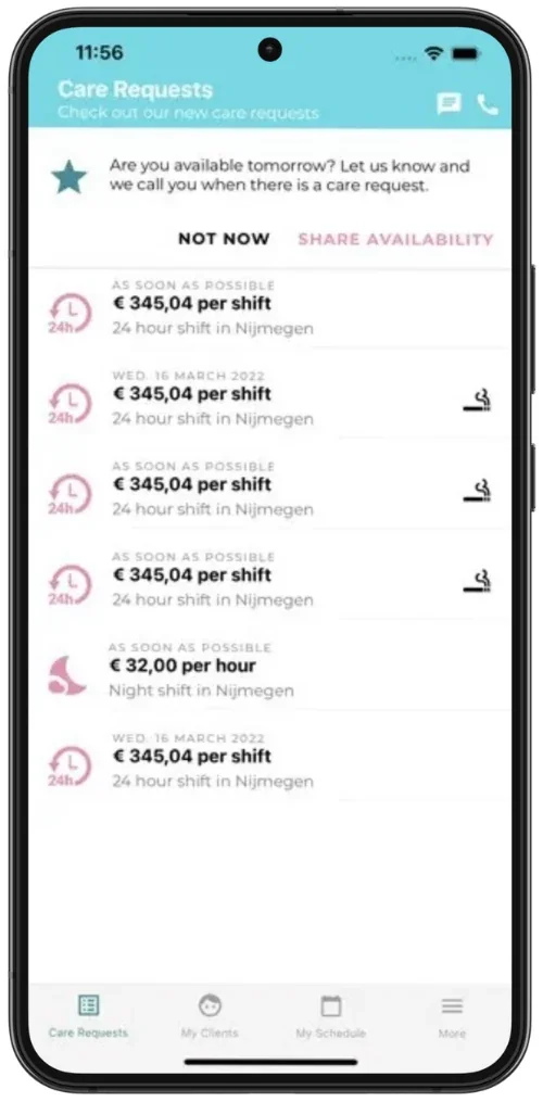
Every care request in the list shows the timing, rate and place. Details are one tap away.

Asking for availability proactively

The app asks whether someone is available tomorrow, so Attenza can call people directly when a new request comes in.

Everything for the decision on one screen

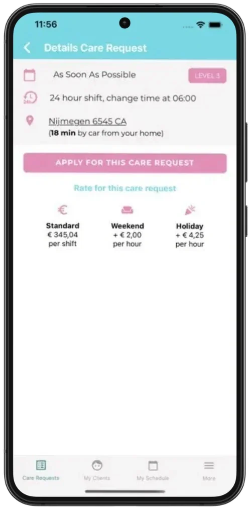
The detail screen shows travel time from home and rates per moment, with one clear button to respond.

Technically feasible from the start

Design and technical design went hand in hand with the development team, iterating within Agile.
04

The design

The app, from first launch to responding to a care request.

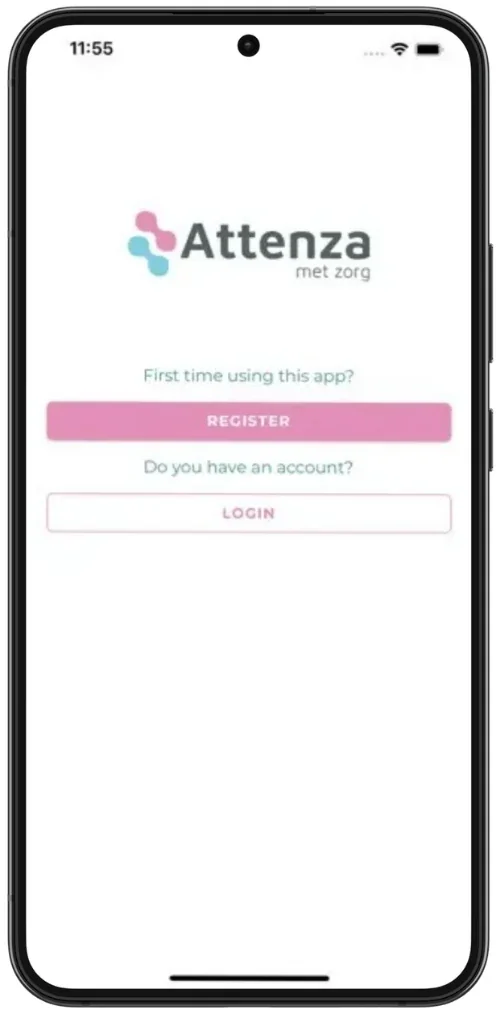
Start screen: register or log in.
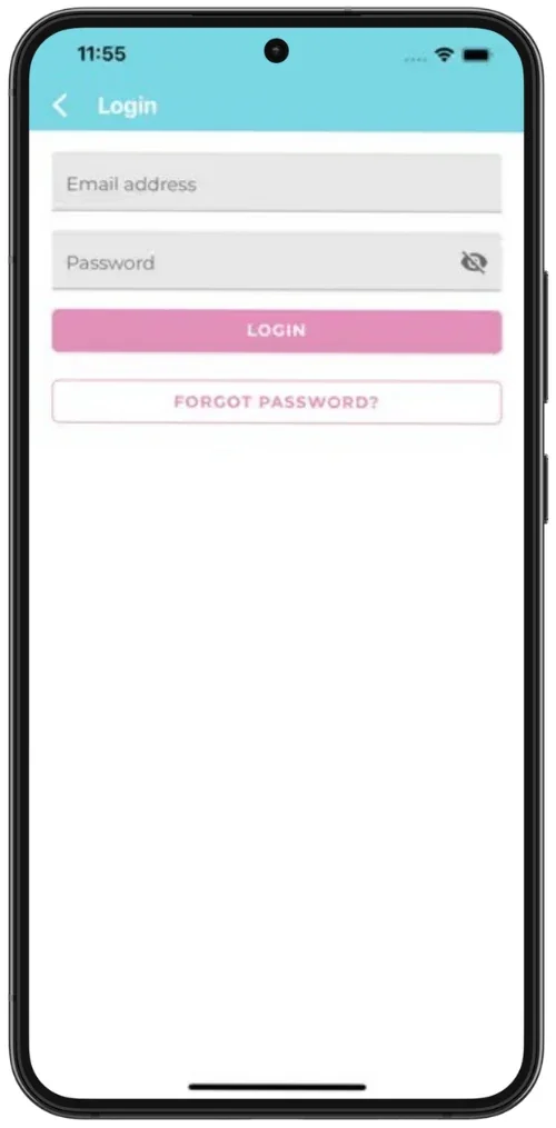
Log in with email and password.
Care requests with timing, rate and place, plus a prompt to share availability.
Care request details, with travel time and rates per moment.

05

Result

  • ✓A better fit with the daily care processes of care professionals.
  • ✓More efficient task handling and a clearer user experience.
  • ✓A stronger link between product and practice, and better collaboration between stakeholders and development.

06

What I'd do differently

In care, UX goes beyond screens: the design has to fit a working day that's already full and unpredictable. Staying close to care professionals mattered more than any design technique.

Work together

Does this challenge sound familiar?

I'm happy to tell you more in a conversation, including what didn't fit in this case.

Get in touch View LinkedIn